
S7 App Navigation
S7 App Navigation
MAU
3.5x
REV
+5%
Description
S7 Airlines is the largest private airline in the country with an app of millions of monthly users. I lead a team of 3 designers for the internal and B2C projects.
client
 Airlines
year
2021 – Present
goal
Make chat and notifications easier to find
results
Increased notifications & chat views by 3.5x
website
s7.ruappstore
S7 Airlines Mobile AppOverview
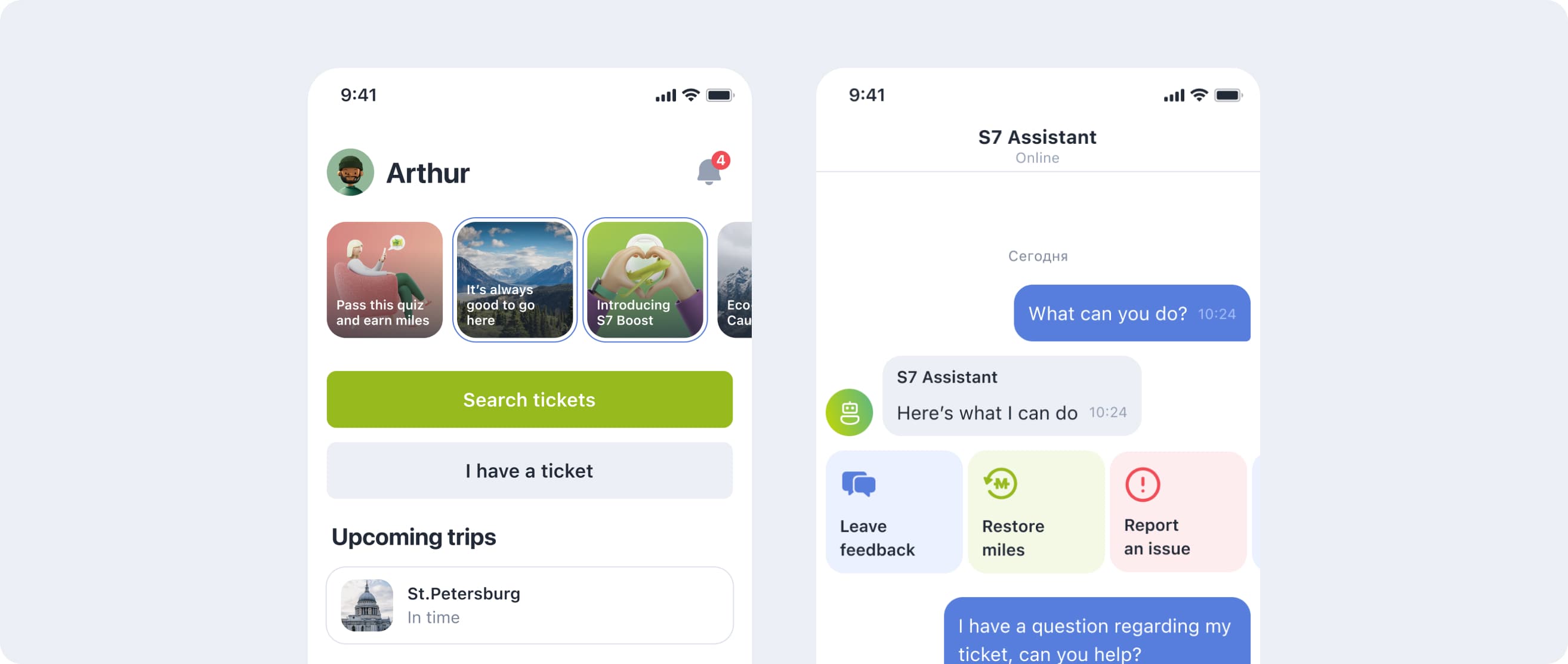
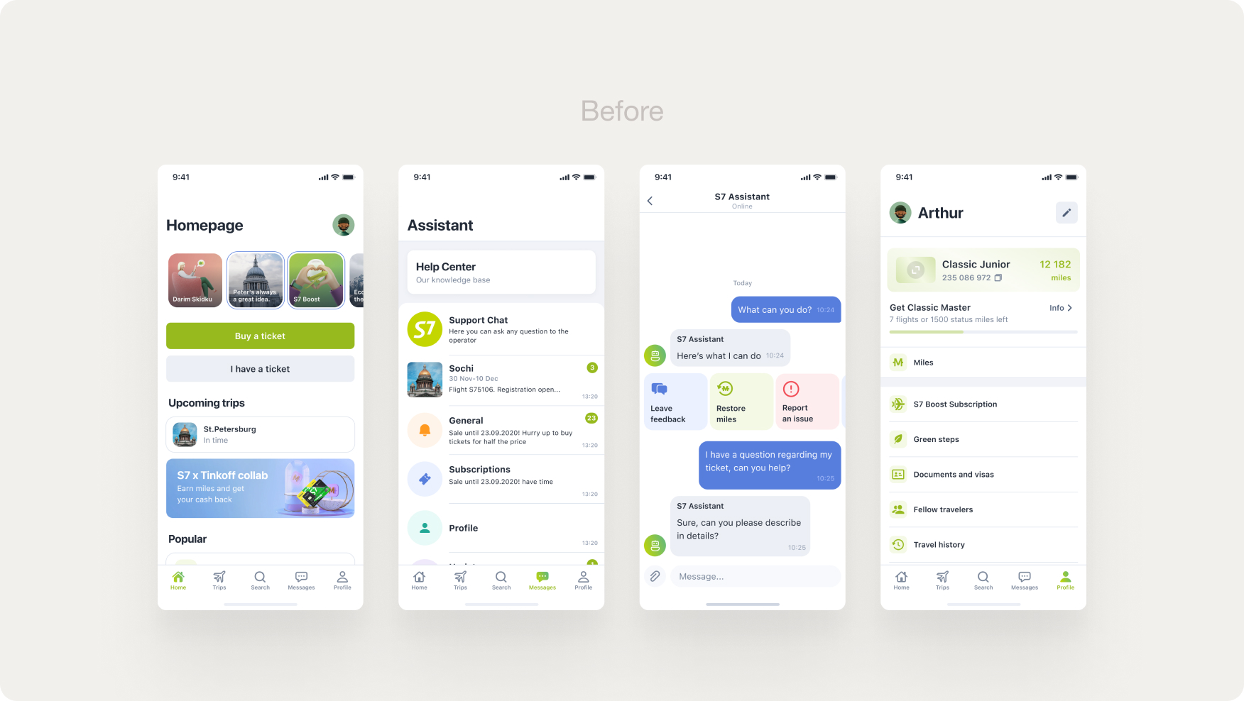
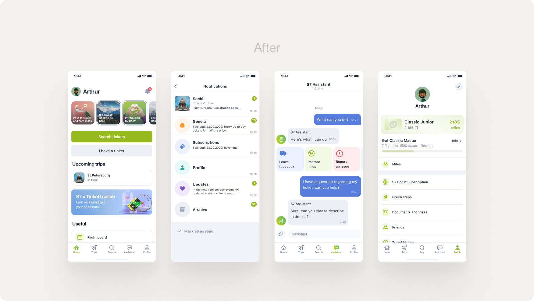
S7 redesigned its app in 2022, changing the overall navigation by introducing a new navbar. It showed good results in enhancing DAU for the Search and Trips pages, but didn't quite change the picture for the Chat tab and almost lowered DAU for the Notifications tab.
The Chat and Notification tabs are prior for the company, as they help solve flight ticket-related issues and stay in touch with important changes in their flights.
Initially, I wasn't involved in the redesign as I haven't worked at the company for that moment, but when I joined S7 as saw an opportunity to make both Chat and Notification pages easier to find.
Problem
The main problem with the newly redesigned Messages tab is that it combines 3 different entities – FAQ, Support chat, and Notifications while keeping them under ambiguous title Messages in one list.
I formed my hypothesizes as follows:
- Combining 3 different entities in one list makes them unpredictable for the user to find.
- The title Messages is misleading for the tab with 3 different entities.
- Notifications are confused with Chat dialogues.
- It's inefficient and user-unfriendly to put both FAQ and support chat next to each other, forcing users to make redundant actions, as both FAQ and chat perform the same task.
If my hypotheses were true, we could make both Notifications and Chat easier to find, thus increasing their MAO and even income, as they both lead to sales.
Research and Design
After forming hypotheses and sharing them with the team, I received a green light to start research.
I started with the following methods:
- Public pool. Result: users expect notifications to be on the Homepage, not the Messages tab.
- Usability test with an interview: user repeatedly confused Notifications with the support chat dialogues and couldn't find support chat on the first try.
Additionally, I asked our research lab to test my hypotheses, for which they also used a question pool, but with different questions and more users. It turned out that:
- None of the notification types are associated exclusively with the “Messages” tab title. Users expect Notifications to be on the Homepage or Profile tabs.
- The better suiting name for the support chat tab would be “Chat” or “Assistant”.
Based on the research, I redesign the app navigation, placing Notifications on the Homepage and making support chat the only entity on the “Messages” tab. The tab was renamed to “Assistant”.
Results
The measured results for this product are the following:
- Increased notifications page views by 3.5x
- Increased chat tab views by 3.5x.
- More MAU leads to more revenue, generated by support chat, as it's also a selling touchpoint. The generated revenue grew by 5%.
Surprisingly, the results are nearly identical.
For confidentiality reasons, I have omitted the actual values for these metrics.